 Once you’ve persuaded people on your website to click on a call to action, you might think the hard work is over. However, once the call to action brings them to your landing page, they have to fill out your form. If you’re not careful when designing your form, you might have visitors who take a look at your form and leave the page. We’ve compiled a list of the common mistakes that people make when designing their forms to help you create forms that will maximize conversion rates.
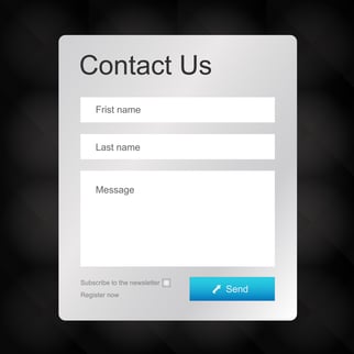
1. Wrong Number of Form Fields
A common mistake that people make when creating a form is including too many or too few form fields. In order to find the ideal form length, you should conduct A/B testing and examine the results. If your form is too long, people will not fill it out or will give up halfway through. However, if your form is too short, you will not have all of the information you need to properly categorize and contact your leads. Establishing the ideal length of your form is an important step in maximizing your conversion rates.
2. Not Enough White Space
When we talk about whitespace, it obviously doesn’t have to be white. What we mean here is that it’s important to have proper spacing in your form. Make sure your form does not look crowded. Keep it simple and easy to take in all at once. Each form field should be on its own separate line, with proper space in between. When your form looks crowded or confusing, people will be less likely to fill it out because they’ll feel overwhelmed. Additionally, if the form isn’t clear and simple, people might fill it in wrong, interfering with you gaining the important information you need.
3. Boring Call to Action
In addition to the call to action that helps users navigate to your landing page, you’ll need a call to action on your landing page that helps users submit the form. For this call to action, you could just write “submit” with a simplistic format. However, using action words is a better way to encourage people to finish the form and click that button. Use compelling, persuasive language that will get people to click to submit. For more tips on creating a strong call to action button, click here. The more reasons users have to submit your form, the better. For this reason, it’s important to take advantage of the added opportunity to encourage users to submit the form.
4. Using Traditional CAPTCHA
Not all forms require a CAPTCHA. You should never include one unless it’s absolutely necessary, because of the added step for users. However, if your form does require human verification, you should use a smart CAPTCHA like reCAPTCHA, where users simply need to click “I’m not a robot.” It’s important to make the process of filling out your form as simple and smooth as possible for users. Any difficulties in filling out the form provide an added opportunity for users to give up and leave your page before they fill out the form. For this reason, you should never use more complicated CAPTCHA’s that could be frustrating to users. If a CAPTCHA is so hard that the user fills it out wrong the first time, they’ll be unlikely to fill out the form a second time and try again.
5. Failing to Simplify the Form
You should avoid including optional fields on your form where you can. The simplest possible version of your form is the best version. If some form fields will only apply to certain people, have those forms appear only when users select certain options. When users see a complicated, long form, they’ll be less likely to fill it out. They also might skip over parts of the form that you actually need them to fill out. When you keep your form as simple as possible, users will be more likely to fill it out properly.
6. Your Landing Page Seems Like Spam
The layout of the landing page on which your form can be found is important to the effectiveness of your form. Make sure your landing page looks high quality and loads quickly. If your page looks like spam, is too complicated, or has too much content, people will be less likely to trust your site and will therefore be less likely to fill out your form. Your page should have enough information to convey the value of the form, but not so much that it detracts from the appearance of the page. In general, you should keep your landing page simple and professional to maximize the amount of users who will fill out and submit your form.
ImageWorks, LLC | CT Inbound Marketing Agency
Developing an inbound marketing strategy can be a daunting task. Many business owners walk into our office without knowing where to begin. Do not be discouraged. With technology and the digital marketing age moving as quickly as it does, we understand that you may have limited knowledge. We will always take the time to explain to you the process behind our projects. If something confuses you, you will never be judged for asking.
Combining blogging, SEO, social media, paid advertising, paid search, and other inbound marketing services, our experts will work with you to develop the ideal strategy for your business. We can help you generate leads and take your online presence to the next level!