 Landing pages are an essential aspect of all inbound lead generation efforts: every campaign effort that you run, event that you host and funnel offer that you create should be tied back to a landing page.
After driving traffic to your landing pages, you ought to make sure your design not only positively presents your brand but is also attracting and converting targeted traffic into qualified leads. We have designed hundreds of landing pages for our clients, and have learned quite a bit. Here are a few landing page design tips you can use to start converting more of your traffic.
Include Real, Convincing Testimonials
Positive endorsements from previous customers can give your web visitors assurance that you are legitimate- if they are done correctly. Word of mouth is one of the most powerful forms of marketing there is, and testimonials, reviews, and endorsements are your closest chance to social proof. However, many companies include landing page testimonials that are far too generic and week; they are simply not believable. Ideally, you want to use testimonials that describe how your client has benefited from something you have helped with. The more detail there is, the more "human" they appear, and the more human, the more believable.
Optimize Test Button Color, Shape, Size
There is a science behind rounded corner buttons: the color, shape, and size of the button is a large part of conversion psychology. The call to action button on your landing page is the most important item that you want clicked by visitors, so it is essential to make sure it is performing at peak condition.
Your button's color should contrast from the rest of the site so it sticks out. Don't make it the same colors as other elements on your site. Instead of using exclusively rectangles, squares, ovals, or other shapes, try using a combination of shapes. Your button size is also worthy of some easy testing. Increase or decrease the size to determine which gives you the highest conversion rates. Typically, bigger performs better.
Remove Navigation & Unnecessary Text
You might think it's extremely important to provide a visitor with all the benefits and everything your company can offer on your landing page. It is not. Removing unnecessary paragraphs can often improve the experience for the visitor and make it easier to understand, helping to increase conversion rates. Remember, attention spans have never been as weak as they are today.
Unlike the other pages of your website that are designed to be more informative and educational, landing pages are entirely conversion focused. From this, removing the navigation from your landing page design will focus the viewers attention on exactly what it is you want them to do- fill in their contact information to access your exclusive content.
Establish Trust Through Verification
Quite frequently, the traffic you are sending to your landing pages (specifically at the top-of-funnel) isn't entirely familiar with your organization. If you have earned any recognizable certifications, awards or badges, display them on your landing page- this will help visitors quickly validate your organization's quality credentials.
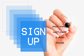
Only Ask For Necessary Information
The more fields you ask visitors to fill out, the less chance you have of them completing your offer. If your conversion requires a form (as most forms do), get the minimum of what you need from them-- you can always ask for more information on the thank you page once the deed is done.
The rule of thumb is not to include more than seven fields in your lead generation form, if at all possible.
Be Mobile Friendly!
Don’t make your mobile visitors zoom too much. If your pages are mobile friendly or responsive this shouldn’t be an issue but make sure your reader doesn’t have to pinch and zoom to read your call-to-action.
Also, make sure buttons are thumb sized. When we want our readers to take action we usually do so by including links or buttons. Small and compact content is difficult for users to click on mobile devices. Don’t let your user fat-finger around your site.
Design clickable targets (links, buttons, icons and form fields) to be touch-friendly. Typically, minimum target area suggestions are 44x44 pixels.
