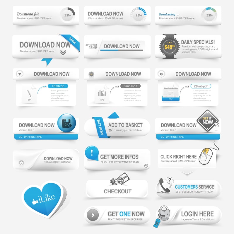
Your call to action buttons are a vitally important part of your website. A great CTA button can direct users, get them to take a desired action, improve conversion rates, and ultimately improve your lead generation. Let your users take action when they are happy with the information they read and utilizing CTAs will allow you to achieve that. However, it's important to think strategically and creatively to ensure your CTA is successfully achieving the objective.

Proper Placement
Knowing where to place the call to action button on your page will lead to more clicks. If your button is too small, tucked away into the corner, people may not even realize it's there. Lead readers to the button by placing it at the end of the content and letting them know if they want more information to click the button below. Sometimes a call to action can be placed in the middle of the site's content as long as it relates to the information and is does not disrupt the flow. Placing a CTA on a landing page can lead prospects to a form they can fill out, contact information, or a guide for more information on the subject matter. Make sure when strategically adding a CTA to your site, it's an appropriate size that does not take away from the information but is large enough for people to click on. The placement is an important aspect to turn prospects into leads which generates to more customers.
Simple But Colorful Design
When you want a specific aspect on your page to be noticed, brighten the color or change from the other colors on the page while staying along with the same color scheme. However, it's important your CTA isn't so bright that it distracts from the other components. A happy balance will allow for the information to be read that then leads the interested prospect to the CTA for more information. Like creating a website, your button also needs to be appealing and creative. Keep your pages consistent and make sure your CTA stands out instead of getting lost in the mix. Whitespace is another instrument you can use to prevent your CTA from blurring in with other components. Whitespace can be used strategically to make certain areas of your page pop out from the rest without overwhelming the eye.
Catchy Text
The text within the button should be short but catchy that peaks the reader's interest. A CTA that simply says "click here" is elusive and uninviting to the reader. Why should they click on the link if they don't even know what the information will entail? A call to action should lead people to something that can help fulfill their needs such as downloadable guides to give them detailed information but the button should clearly state what they are clicking on. The text needs to be commanding and simple to tell prospects to take action. The message should be attention grabbing so they feel they can benefit from your products or services and know what is in it for them. Just like the design, be creative and unique so your call to action stands out from the mix.
Make Buttons Mobile Friendly
Smartphones have taken over and people seem to use their mobile device more than computers for internet access. Make sure to test your landing pages that are specifically designed for mobile (or use responsive design) that allow users to easily access all the information. CTA buttons should be easily clickable, and should not interfere with any other elements on the page. As online mobile advances, it's important your site does as well along with the elements that make up each page.
Try our inbound strategy session below to turn your website into a lead generating machine.

