Call to actions are an effective and strategic way to turn prospects into leads. A strong CTA button needs a few well thought out components for the appeal and functionality. You want to get those visitors to become leads, leads to become customers, and then customers to become promoters and effective CTA's do that for your company. This article will describe what mistakes to avoid while creating your CTA buttons.
Dull Design
Like creating a website, your call to action button also needs to be appealing and creative. Construct a unique design for the CTA and make it stand out so more people can see it. Follow a color scheme but make sure the button doesn't blend into the page it is on. If your site is full of all the same colors, then nothing on your pages are going to stand out. You don't need to have too many colors or your site can become overwhelming to the eye. Keep your pages consistent and make sure your CTA stands out instead of getting lost in the mix. Whitespace is another instrument you can use to prevent your CTA from blurring in with other components. Whitespace can be used strategically to make certain areas of your page pop out from the rest. Be creative because your CTA is what people can click on to get to know more about your products and services and eventually generate into leads.
Too Big/Too Small
You need to be able to find and effective balance for the size of your CTA. It is vital that your button isn't too small or too big. Companies often feel if they go smaller, that people can still see the call to action but at least it doesn't feel as though they are pushing it on people. However, too small means people may not even see it but too big can be overwhelming and make people nervous to click. If it were a more obvious feature, you'll find it's easier to get conversions. A larger CTA is also easier to read and allows for more descriptive button text but try to avoid making it the center attention of the page. Have a button that stands out without it taking over. Your button must be large enough to be seen and appealing, but also small enough so people don't get nervous to click on it.
Text Is Elusive
A CTA that simply says "click here" will be confusing to the reader. Why should they click on the link if they don't even know what the information will entail? A call to action should lead people to something that can help fulfill their needs such as downloadable guides to give them detailed information. Make sure the text describes what information the reader will be receiving and make the it creative enough so they feel compelled to check it out. The text needs to be commanding and simple to tell prospects to take action. The message should be attention grabbing so they feel they are able to benefit from your products or services and know what is in it for them. Just like the design, be creative and unique so your call to action stands out from the rest.
Too Many
You want to have CTA's that stand out but that doesn't mean you should flood your landing pages with too many. If you push too many on the reader, they are going to be overwhelmed and unaware what they actually need from your page. Don't take away from the other components on your site because that information is important as well. The content on your landing pages should be what makes them want to know more so they click on the CTA, not the other way around. An overpowering amount will make your company look desperate and loose credibility because you're not interested in helping them but actually just concerned about getting a sale. Your page should be simple to navigate and lead people to the information they need. People are not going to hunt around to figure out how you can help them but rather just leave your site and go straight to your competitors.
Broken Link
The worst thing is to have a CTA that doesn't work. This can really kill the reputation of your brand and make your business seem unreliable. Always test out the links to make sure they are functioning properly. You have done everything else right by picking a bright color, adding a little whitespace, creating strong text, perfect size and placement but if it doesn't properly function, all the time was wasted. Constantly test the link to make sure you understand how the button functions and leads people to the information they need. Testing the call to action will also show you the results you get and the effectiveness of the button's link.
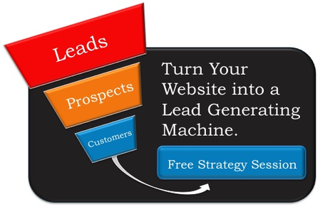
Check out the CTA below to find out how to turn your website into a lead generating machine.