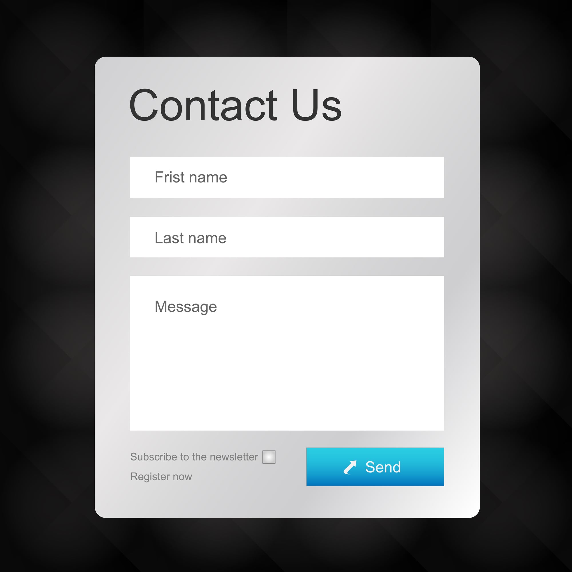
Once you’ve persuaded people on your website to click on a call to action, you might think the hard work is over. However, once the call to action brings them to your landing page, they have to fill out your form. If you’re not careful when designing your form, you might have visitors who take a look at your form and leave the page. We’ve compiled a list of the common mistakes that people make when designing their forms to help you create forms that will maximize conversion rates.
1. Wrong Number of Form Fields
A common mistake that people make when creating a form is including too many or too few form fields. In order to find the ideal form length, you should conduct A/B testing and examine the results. If your form is too long, people will not fill it out or will give up halfway through. However, if your form is too short, you will not have all of the information you need to properly categorize and contact your leads. Establishing the ideal length of your form is an important step in maximizing your conversion rates.


