 So you've slaved over your new landing page for hours, making everything just right; yet, the conversions you were hoping for don't come. No matter how well you've designed your landing page, there is always room for improvement.
Landing pages are widely used to launch webinars, products, and other various offers to persuade visitors to give you some of their contact information. And as we all know, once you have a visitors email address you can communicate with them on a more personal level, which helps to establish relationships and also encourage them to do what you wish them to do.
Your task is to make sure your forms are designed in a way that doesn't scare off users. In this post we will discuss common reasons why people decide not to fill out landing page forms. If you want a landing page that can convert users, you should avoid these mistakes.
Too Generic To Entice Users
If you send your users to a simple landing page that only contains a form prompting users to “contact” you, it’s likely that you won’t be seeing many conversions. Landing pages must contain a clear and compelling reason for filling out the form, and if you neglect this step, you won’t be pleased with your bounce rate.
Typically landing pages are created to be a gate between users and useful collateral like eBooks, demos, consultations, comparison charts, etc. Essentially, all of these offers are specific with a clear value proposition, so that users know what to expect when they fill out the form.
The Form Looks Like An Epic Novel
So, maybe you have created a clear and concise landing page that features a distinct value proposition, and still, nobody is filling out your form. In this case, it may be helpful to consider whether your form is too long. Ideally, your form’s length should coincide with the value of the offer behind it. So, if you are offering an eBook, your form should be shorter; yet, if you are offering a detailed one-hour consultation, it’s fair to expect that you should capture more information.
Too Much Or Too Little Content
There are few things more frustrating to a lead than coming across a landing page and having no clue what to do next. Unfortunately, a lot of businesses make the mistake of trying to stuff their landing page with too much information. Though their intentions are good, conversion rates will suffer if you do this.
On the other hand, if you offer too little information on your landing page, it can be just as confusing-- the user won't understand what they're getting. So, make sure the directions on your landing page are obvious, and be sure to include any important information that tells leads what they will be getting by filling out the form.
Your Ignoring The Sales Funnel
While the buyer’s journey is often discussed in the context of lead nurturing, it applies to landing pages as well. Visitors to your landing pages will obviously have different needs based on where they are in the sales cycle. Your page content should cater to those preferences.
For example, consider including a small bulleted list describing your offer’s benefits, as this will help top of the funnel prospects. Case studies are wonderful for middle of the funnel prospects and a clear “Start Free Trial” button often works well for bottom of the funnel prospects.
Low Quality Copy
The overall quality of your landing page copy goes well beyond the grammar and spelling. Your writing needs to quickly communicate certain things to a site visitor. Your copy should communicate that you understand the visitor’s problem; that you have a solution that could be used to solve their problem; that they just need to take the following step to get closer to their solution. If a visitor fails out at any of these checkpoints, they are going to bounce before they go any further.
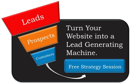
If you've steered clear of these mistakes, you'll have a greater chance of converting leads. However, your job as a marketer is never done; learn how to turn your website into a Lead Generating Machine!

